
Brand design and graphics created for a Graphic Design course assignment
Chicago Athletic Clubs is a premier chain of fitness facilities across Chicago, supplying state-of-the-art equipment, dynamic personal training, and over 1,000 workout classes a week. CAC fosters a motivating, community of wellness enthusiasts in seven neighborhoods throughout the city.
The Objective
The objective was to redesign CAC’s branding system to reflect the club’s caliber and the passion so many Chicagoans have for their city.
The Challenge
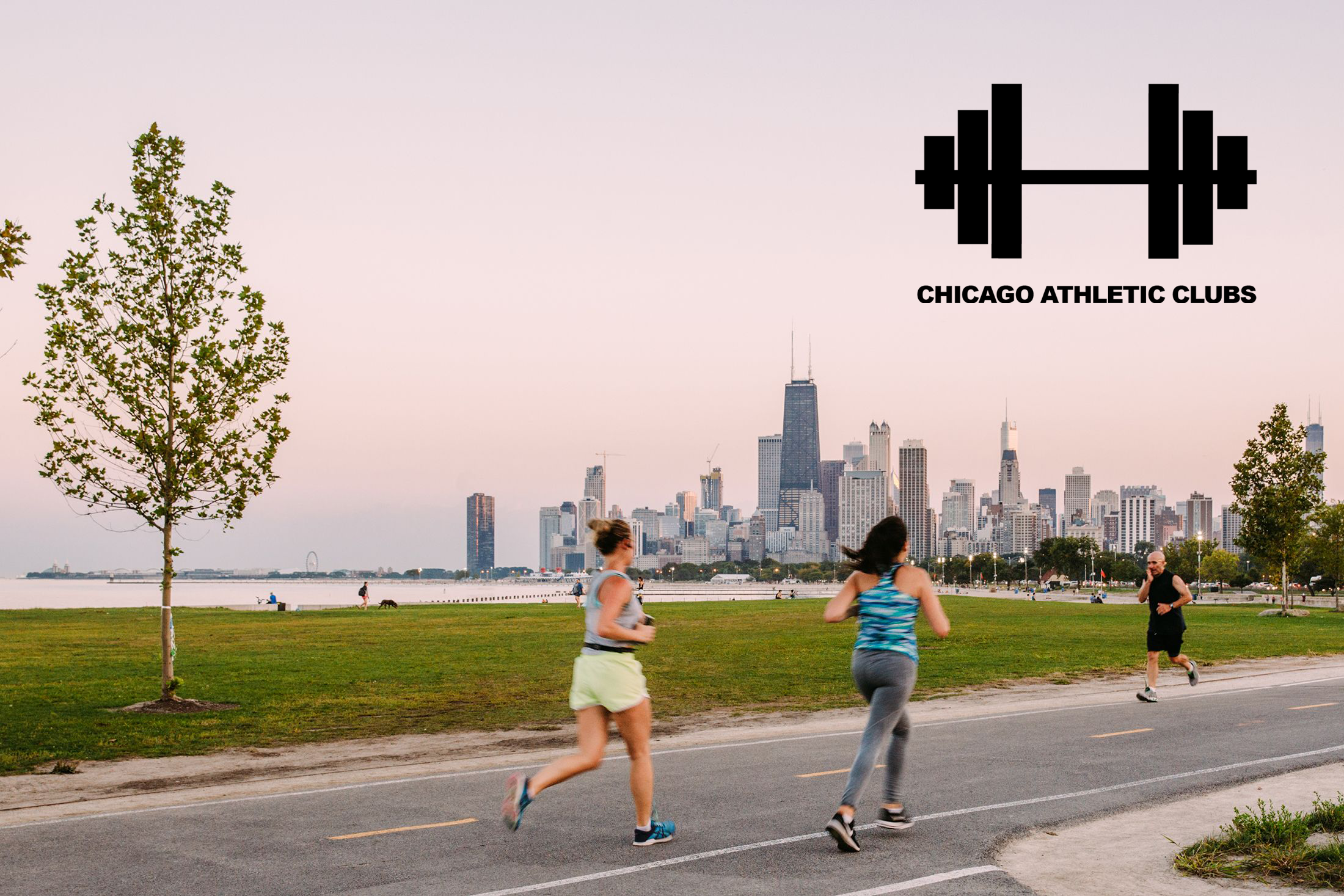
I wanted the branding system to portray the scope of CAC’s position in the fitness community, offering both quality and community. Chicago fitness enthusiasts should see this logo and immediately associate it with their nominated home away from home: Chicago Athletic Clubs.

Brand Archetype
The Hero brand archetype represents many leadership qualities, like courage and vitality. I wanted to adhere to the Hero brand archetype, reflecting the high level CAC sits at in terms of quality. To match the definitive qualities of the archetype, I omitted the colors of the original logo, which allowed me to simplify the logo to a geometric icon, with a complimentary, bold sans-serif font.
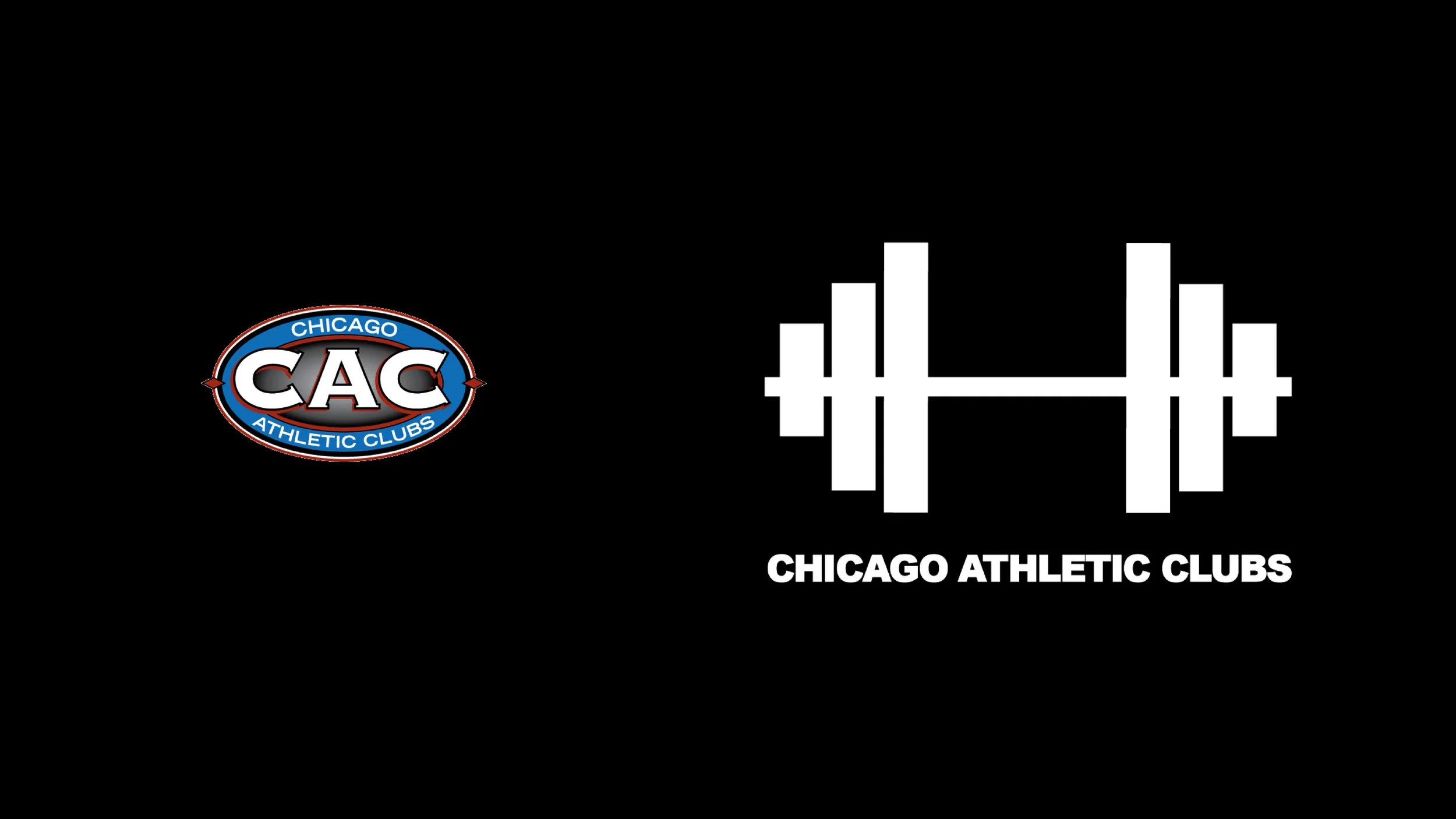
Original Logo
The Logo
CAC’s central identity is to emphasize a high quality fitness experience in an urban community. The resulting symbol reflects a piece of equipment people immediately associate with working out, but also one of Chicago's dominant attractions: the beautiful skyline.
